Modern solutions to common web accessibility mistakes

An accessible web app is one where all features and content are available for all users, regardless of how they access the app, or any impairments they may have. The following is a list of common accessibility mistakes web developers make.
Landmark roles
Landmark roles organize and add structure to an HTML document. They are used by assistive technology to quickly identify and navigate to sections of the document. Unfortunately, web pages often don’t make use of landmark roles. Let’s look at the available Landmark roles, and when to use them:
banner
The banner role identifies the global header. We can make use of this role by adding role="banner" to an element, or by utilizing the <header> tag outside of any of the following tags: <aside>, <article>, <main>, <nav>, or <section>.
complementary
The complementary role identifies a supporting section of the main content, yet can stand alone when separated. For example, a list of featured items that render on the side. We can make use of this role by role="complementary" to an element, or by utilizing the <aside> tag.
contentinfo
The contentinfo role identifies content often found in the footer such as copyright info. We can make use of this role by adding role="contentinfo" to an element, or by utilizing the <footer> tag.
form
The form role identifies a group of form elements. We can make use of this role by adding role="form" to an element, or by utilizing the <form> tag. It’s highly recommended to use the <form> tag, as it contains many additional accessibility features.
main
The main role identifies the primary content of a page. This is the content that changes as you navigate the app, as opposed to a header or footer which often will remain the same. This role allows users utilizing screen readers to easily skip to the page’s primary content. It is often combined with a skipnav for an even better UX. We can make use of this role by adding role="main" to an element, or by utilizing the <main> tag.
navigation
The navigation role identifies groups of links used for navigating the app or current page. We can make use of this role by adding role="navigation" to an element, or by utilizing the <nav> tag.
region
The region role identifies areas of a page that are significant. Often used within the main tag to organize the content of a page into sections a user will likely want to navigate to. We can make use of this role by adding role="region" to an element, or by utilizing the <section> tag.
search
The search role identifies search functionality on a page. We can make use of this role by adding role="search" to a <form> element.
Labeling landmark roles is also important. For example, if your page contains multiple searches it’s important to label them to show what is being searched. Use the
aria-labelrole to label ambiguous landmarks.

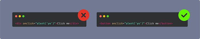
Pseudo-Buttons
You’ve likely seen a pseudo-button or pseudo-link before. These are elements that try to replicate the functionality of a button or anchor, on other elements. A div with an onclick, for example. This is almost never a good idea. The effort required to make these accessible far out-weighs whatever reason you have for implementing them. Let’s take a quick look at the features built into the <button> element.
- Focusable: A button can be focused by tabbing
- Keyboard interactions: Pressing enter or space while focused will activate the button
- Screen readers announce the element as a button
- Additional attributes such as: autofocus, disabled, type, and many others.
Why are devs drawn to this anti-pattern? The most common reason I’ve seen is that it’s an easy way to remove all browser styles from the button. Today, there is an easier solution to that problem: Simply add the unset style to your button’s css:
button { all: unset }
Forms
When building a web app most of the interactions available to your users will come in the form of … forms. It makes sense that special considerations should be made to make your forms accessible. Let’s take a look at some form accessibility best practices.
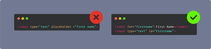
Programmatic labels instead of placeholders
Every form input needs a visible label. A placeholder is not adequate. Use the label tag along with the for prop to associate a label with an input.
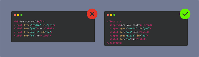
Grouping form controls with a fieldset
If you have a question on your form with multiple input controls, you should group the controls in a fieldset, and use a legend as the label for the question.
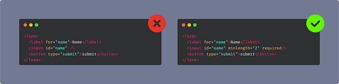
Invalidating & Alerting
It’s important to alert the user when an error has occurred, and where. The native form validation features handles this for us, but if you’re rolling your own validation then you’ll need to manually toggle the alert and invalid aria roles.
Building forms in React? Make sure you checkout my post: Mastering the Art of Forms in React.
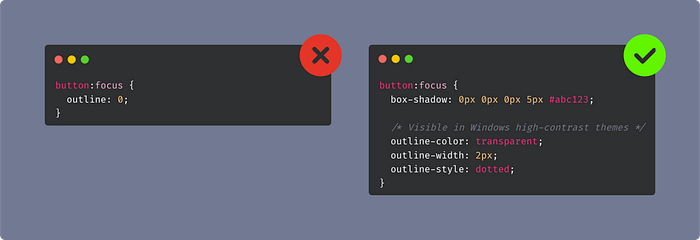
Removing focus outline
It’s not uncommon to see an app where the focus outline has been removed. This is problematic as people with mobility problems will often use an app with keyboard interactions, and rely on the outline. While I agree, it doesn’t always look pretty, there are better solutions than removing it.
Better focus styles with box-shadow
If you want more control over the look of the focus outline, you can override the styles to use box-shadow. There is a caveat here though. When a Windows high-contrast theme is turned on the box-shadow wont be visible to the user. We can get the best of both worlds though by setting a box-shadow, and outline-color: transparent
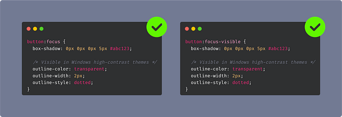
Better UX with focus-visible
If you’re like me, you really don’t like when you click a button and it shows the focus styles. This can be prevented by using :focus-visible. This allows the focus styles to appear only when the element has been tabbed to.
Conclusion
By writing semantic HTML, using HTML elements as intended, and being empathetic towards all users who use our apps, we can craft more accessible apps with little extra effort. Lastly, I recommend using Axe-Core to test the accessibility of your app, and if you use Cypress checkout Cypress-Axe.

